CSS / Reference / accent-color
Contents
개요
accent-color는 HTML의 폼 요소에 사용되는 강조 색상을 정하는 속성입니다. 기본적으로 브라우저는 사용자 인터페이스 요소에 특정한 시스템 색상을 사용하지만, accent-color를 사용하면 이러한 요소들의 강조 색상을 커스터마이즈할 수 있습니다.
다음 요소에 적용할 수 있습니다.
- <input type="checkbox">
- <input type="radio">
- <input type="range">
- <progress>
문법
accent-color: auto | color | initial | inherit
- auto : 기본값으로, 브라우저가 색을 정합니다.
- color : 색을 정합니다.
- initial : 기본값으로 설정합니다.
- inherit : 부모 요소의 속성값을 상속 받습니다.
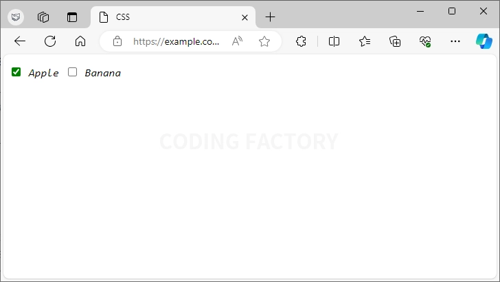
예제 - input checkbox
체크박스를 선택하면 녹색이 됩니다.
<!doctype html>
<html lang="ko">
  <head>
    <meta charset="utf-8">
    <title>CSS</title>
    <style type="text/css">
      body {
        font-family: Consolas;
        font-style: italic;
      }
      input[type=checkbox] {
        accent-color: green;
      }
    </style>
  </head>
  <body>
    <p>
      <input type="checkbox" id="apple"> <label for="apple">Apple</label>
      <input type="checkbox" id="banana"> <label for="banana">Banana</label>
    </p>
  </body>
</html>
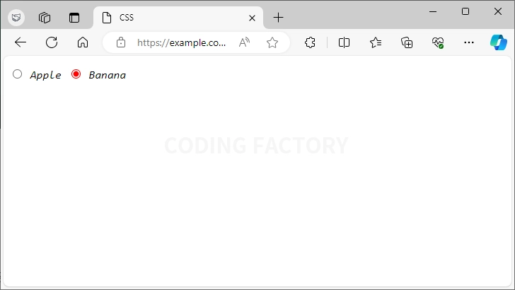
예제 - input radio
라디오 버튼을 선택하면 빨간색이 됩니다.
<!doctype html>
<html lang="ko">
  <head>
    <meta charset="utf-8">
    <title>CSS</title>
    <style type="text/css">
      body {
        font-family: Consolas;
        font-style: italic;
      }
      input[type=radio] {
        accent-color: red;
      }
    </style>
  </head>
  <body>
    <p>
      <label><input type="radio" name="fruit" value="apple"> Apple</label>
      <label><input type="radio" name="fruit" value="banana"> Banana</label>
    </p>
  </body>
</html>
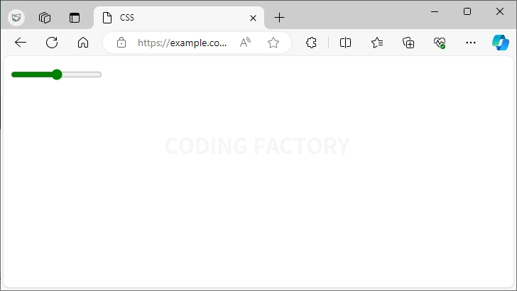
예제 - input range
슬라이더의 색이 녹색이 됩니다.
<!doctype html>
<html lang="ko">
  <head>
    <meta charset="utf-8">
    <title>CSS</title>
    <style type="text/css">
      body {
        font-family: Consolas;
        font-style: italic;
      }
      input[type=range] {
        accent-color: green;
      }
    </style>
  </head>
  <body>
    <p>
      <input type="range" min="0" max="100" value="50">
    </p>
  </body>
</html>
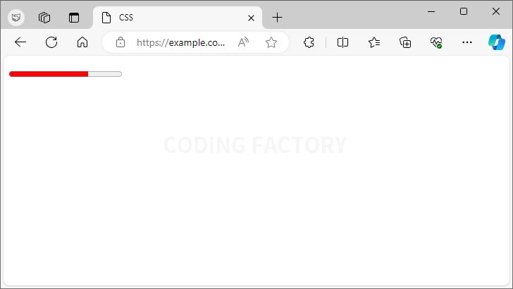
예제 - progress
진행 상태를 나타내는 바의 색이 빨간색이 됩니다.
<!doctype html>
<html lang="ko">
  <head>
    <meta charset="utf-8">
    <title>CSS</title>
    <style type="text/css">
      body {
        font-family: Consolas;
        font-style: italic;
      }
      progress {
        accent-color: red;
      }
    </style>
  </head>
  <body>
    <p>
      <progress max="100" value="70"></progress>
    </p>
  </body>
</html>
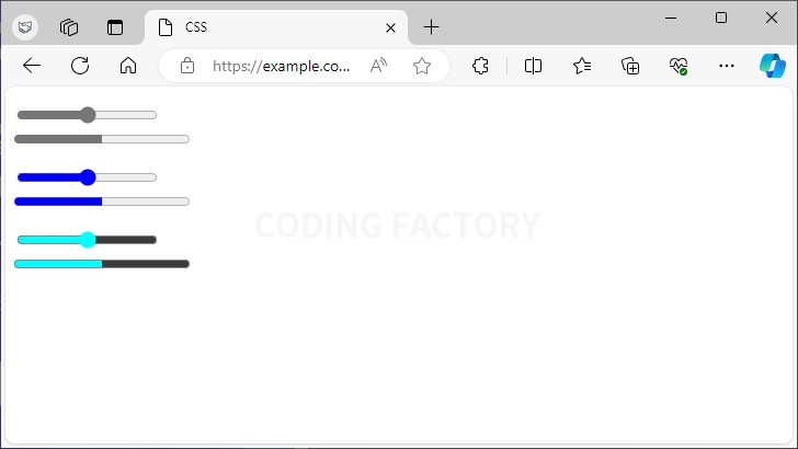
예제 - input range와 progress의 색
타입이 range인 input 요소와 progress 요소는 accent-color에 따라 나머지 부분의 색이 달라집니다.
예를 들어 accent-color를 cyan으로 하면 나머지 부분의 색이 진해집니다.
<!doctype html>
<html lang="ko">
  <head>
    <meta charset="utf-8">
    <title>CSS</title>
    <style type="text/css">
      body {
        font-family: Consolas;
        font-style: italic;
      }
      .a input[type=range], .a progress {
        accent-color: blue;
      }
      .b input[type=range], .b progress {
        accent-color: cyan;
      }
    </style>
  </head>
  <body>
    <p>
      <input type="range" min="0" max="100" value="50"><br>
      <progress max="100" value="50"></progress>
    </p>
    <p class="a">
      <input type="range" min="0" max="100" value="50"><br>
      <progress max="100" value="50"></progress>
    </p>
    <p class="b">
      <input type="range" min="0" max="100" value="50"><br>
      <progress max="100" value="50"></progress>
    </p>
  </body>
</html>
CSS / Reference / list-style-position
list-style-position으로 ul, ol 등의 목록의 마커(marker)의 위치를 정합니다. 기본값 : outside 상속 : Yes 애니메이션 : No 버전 : CSS Level 1
border는 다음의 속성을 포함하는 단축 속성으로, 테두리를 만듭니다. border-width border-style border-color
clip 속성으로 요소의 특정 부분만 나오도록 할 수 있습니다. 기본값 : auto 상속 : No 애니메이션 : Yes 버전 : CSS Level 2
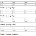
CSS / Reference / border-spacing
border-spacing은 표의 테두리와 셀의 테두리 사이의 간격을 정하는 속성입니다. 기본값 : 2px 상속 : Yes 애니메이션 : No 버전 : CSS Level 2 border-spacing은 border-collapse의 값이 separate일 때만 적용됩니다.
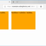
CSS / Reference / backface-visibility
backface-visibility는 요소의 뒷쪽에서 앞면이 보이게 할지 정하는 속성입니다. 기본값 : visible 상속 : No 애니메이션 : No 버전 : CSS Level 3